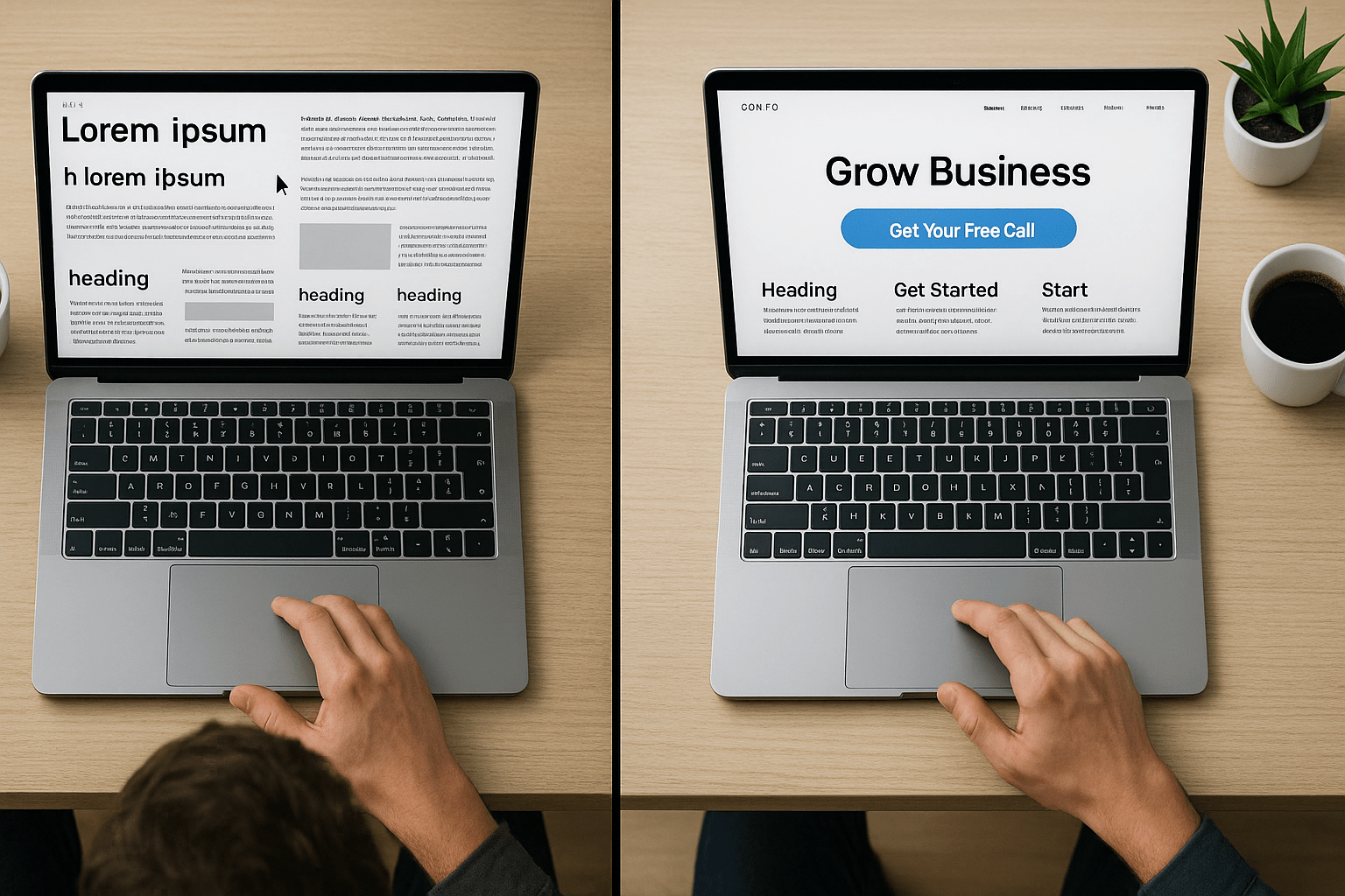
No Call-To-Action = No Clue
Visiots land on your website, read your content, then scroll down.
Then they don’t see a button or a clear next step, and then they leave because your website’s call-to-action doesn’t exist.
The Problem: You’re Showing, Not Telling
You list your services, displaying your features, and showing all your testimonials.
This is all good stuff, but you’re missing the most important part: telling visitors what to do on your site.
If you’re never saying either “Book a call”, “Get started”, or “Buy now”, then your site is just a brochure with company info.
How This Affects Your Sales
No direction leads to no action. Visitors are waiting for you to tell them what to do. So if you’re not saying it, then they’re gone.
You’re paying for ads, running SEO, and driving as much traffic as you can. But your website still isn’t converting because there’s no call-to-action guiding them
Your competitor has a giant “Book Free Consultation” or “Get Your Upgrade” button.
Guess who’s closing the deals?
What You Actually Need
Choose one main action: Pick one primary action you want visitors to take, and put a button for it everywhere. Make sure it’s:
- Big
- Contrast
- Impossible to miss
One clear CTA above the fold: A big button that’s immediately visible with a clear and specific action.
- “Book Your Free Call” not “Learn More”
- “Get A Quote” not “Click Here”
- “Start Your Trial” not “Find Out More”
Repeat it everywhere: Homepage, service pages, about page. Every main page needs a CTA.
- Top of page: Main action (Book/Buy/Start)
- Middle: Secondary (View pricing/Examples)
- Bottom: Final push (Ready? Contact us)
The Final Take
Your website should convert, not confuse.
Without a CTA or clear message, you’re missing out on customers every day while your competition takes them.
I audit sites and fix what’s broken. I’ll show you exactly why visitors aren’t converting and how to fix it.
Limited to 3 calls per week.
Leave a Reply